


BlackVue was originally built around hardware features, but with more LTE models and evolving user needs, Pittasoft aimed to grow its cloud service into a key part of the platform. This renewal focused on improving the UI foundation to support that shift.


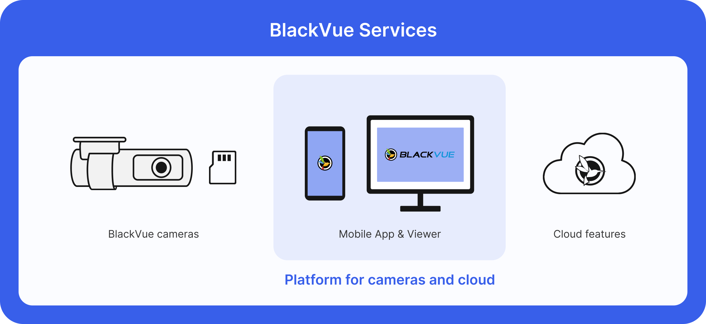
To achieve this goal, our Cloud team re-analyzed the BlackVue service at the time. The original BlackVue service had a non-user-friendly UX interface, designed without professional UX expertise. And while the viewer program and mobile app provided the same service, they had different brand identities. In addition, the uniformity of the service was lost because it showed many types of components on one platform.


To fix inconsistencies and clarify the brand identity, we introduced a design system and applied it to the app, viewer, and web.
- Components were built and organized in Figma
- Shared with PMs, developers, and QA for alignment
- Auto Layout and variants supported dark mode adaptation


We unified components across the app, web, and viewer using a shared design system built in Figma.This system enabled consistent UI across platforms, streamlined collaboration with PMs and developers, and supported flexible updates, including dark mode adaptation.


The Cloud team thought there were many unusual interfaces in the current app. We decided to conduct a usability test to determine if the usability of this interface is actually as low as we think, or if current users are not having trouble using it. The usability test was conducted by dividing existing BlackVue service users and users who had never used the BlackVue service.
We tested interfaces that had been internally flagged for poor usability. Existing users showed little concern, likely because they were accustomed to the current UI or only used limited features. However, first-time users found the interface confusing and difficult to operate.


Since the goal was to attract more new users, we focused on pain points raised by unfamiliar users. At the same time, we kept key visual elements familiar to avoid disrupting the experience for current users.
We prioritized updates for key components that caused the most confusion:


.png)
.png.png)
_mobile.png)
_web.png)

.png)
While the UI updates didn’t immediately affect business metrics, the project created a clear foundation for future improvements.
Some users criticized the release as “only visual,” which we traced back to limited functional changes. But by standardizing UI components and documenting core issues, we positioned ourselves to improve more deeply in the next phase.


This project showed me how real-world UX work often requires balancing ideal improvements with team resources and product readiness. It taught me to align visual updates with real usability gains and to treat all feedback, including negative comments, as a valuable guide for better design decisions ahead.


