


Despite strong interest in the BlackVue product, a relatively low number of users completed the cloud connection process. To understand the drop-off, our service planning team analyzed user data at each step of the connection flow and identified a consistent decline. This prompted us to investigate where and why users were abandoning the process.

We reviewed customer support tickets and conducted interviews with users who failed to complete the connection. Many users relied heavily on printed manuals or contacted support for help. Common frustrations included the lack of in-app guidance and the complexity of the steps.


We walked through the app’s connection flow and identified usability breakdowns that aligned with user complaints.

Through users' pain points, we found out our service has two major problems. Among these two problems, our team decided to prioritize solving problems that have potential for improvement in the current situation and that need to be addressed on a basic basis.


Through users' pain points, we found out our service has two major problems. Among these two problems, our team decided to prioritize solving problems that have potential for improvement in the current situation and that need to be addressed on a basic basis.

We identified five core usability issues but limited our scope to three that were feasible to address immediately within the current technical and resource constraints
I decided to address the pain points identified earlier with the product manager by improving the overall connection flow. The first step was to simplify the flow to resolve the issue of too many steps to access settings.
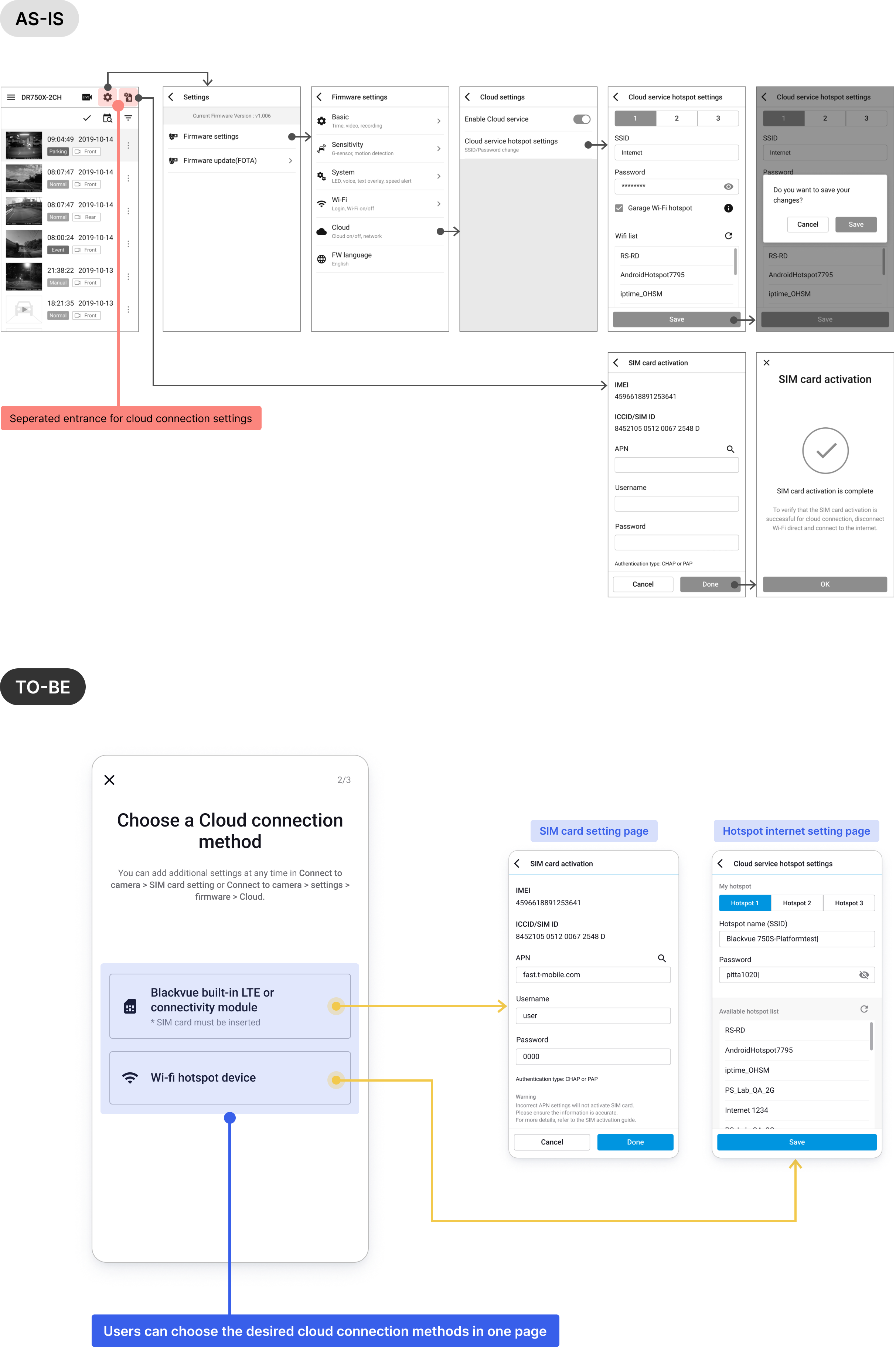
We removed unnecessary steps and streamlined the process from 17 to 13 screens, reducing cognitive load and effort.


The project manager and I leave out the complex steps to guide users to the cloud connection setting stage so they can move directly to the cloud connection stage after completing the camera registration stage that most users execute.
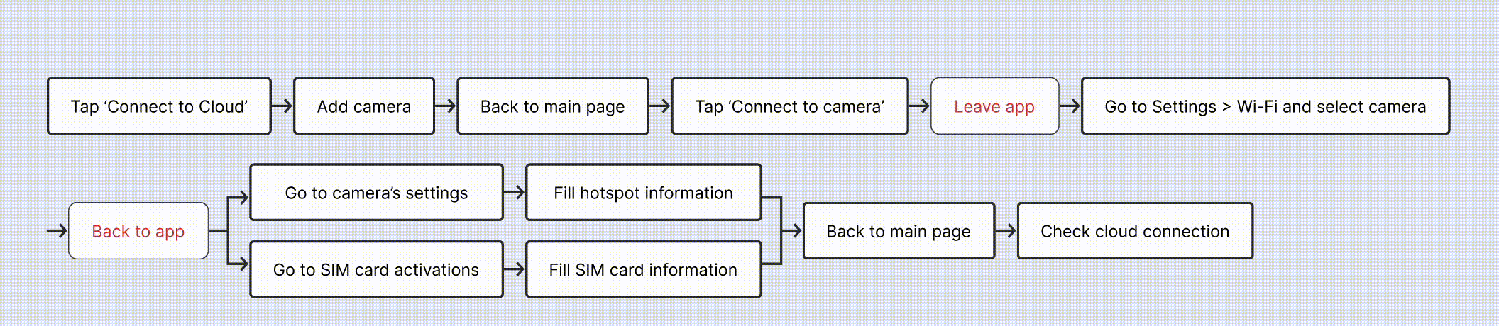

In the new connection flow, the SIM activation and wifi hotspot information settings, which were previously separated and located elsewhere, are displayed on one page so the user can select the desired connection method.

To assist new and returning users, we added a guide screen before connection setup. Another guide was added after setup to help users understand what happens during automatic connection.


Due to technical limitations, real-time connection feedback could not be provided. Instead, we explained what a successful connection looks like and how to confirm it through UI cues, improving user confidence during waiting periods.


We added a retry button to all cloud-dependent screens. This allowed users to reconnect from any context, reducing frustration and navigation overhead in case of failure.

To introduce the new guidance step, I proposed two UI directions. My preferred version was more informative but raised concerns about visual complexity. After stakeholder review, we chose a simpler layout that balanced clarity and user retention.

After deciding on the design options for the guide, I made a high-fidelity prototype using the design system's components. A simple test was conducted with internal stakeholders using the prototype, and each department gave feedback on the final result. Our team collected and recorded those feedback as an insight necessary for the next renewal.

After launch, the new flow led to a 3% increase in successful cloud connections over a four-month period. While modest, this validated that usability enhancements had an impact.
However, the limited improvement raised two key hypotheses:


Due to hardware dependencies, some improvements could not be addressed within this project. However, our findings led the hardware team to begin planning a built-in LTE model to remove network setup complexity altogether.
Our team also initiated a follow-up project to further simplify the UX flow based on the hypotheses. This cross-functional collaboration laid the groundwork for improving long-term usability and increasing cloud adoption.


